Showing posts with label print. Show all posts

Friday, May 11, 2012

LDN - SYD

Things have been so hectic (an exciting whirlwind trip to Guatemala and Peru that we have to keep under wraps until later in the year) that I've only just been able to sit down and get stuck into blogging again. Ca was about to kick my ass for being so tardy with this "Last week in London" post, so much to cover so be prepared for a pretty long post!

Back in February I was lucky to spend almost a month back in London, to be honest I was missing it heaps since returning home to Sydney. Staying with friends in East London it was almost like I was living back in the old neighborhood spending Saturday afternoons at Broadway Market, strolling through London Fields for my morning coffee at Climpson & Sons, the Sunday guantlet that is Columbia Road Flower Markets...

In my last week I squeezed in a couple of exhibitions, hunted down some printed ephemera, caught up with the hugely talented Hattie Newman over cake and tea, had drinks in an East London secret bar and created my first ever chalk mural for HiRes! London. It was an awesome trip and I can't wait until I can go back again.

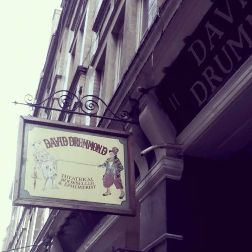
David Drummond at Cecil Court
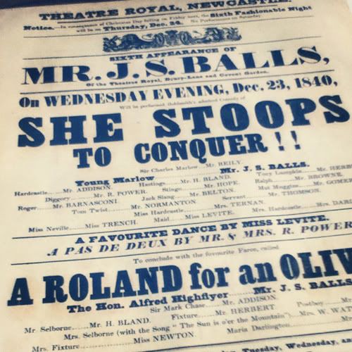
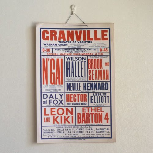
For any lovers of printed ephemera Cecil Court (Leicester Square Tube) is a place you must head down to. The street is lined with various shops each with their own specialty but for theatre lovers David Drummond is the store to visit.
I was hoping I could catch an Ephemera Society Bazaar while I was in London but unfortunately the dates didn't line up. But we got a tip to check out Cecil Court and oh-my how I wish I had made the trip earlier. The store is filled to the brim with all sorts of theatre ephemera, their selection of play bills is vast and ranges from the earlier black and white prints from the 1800s to the bold coloured bills from the 1950s.


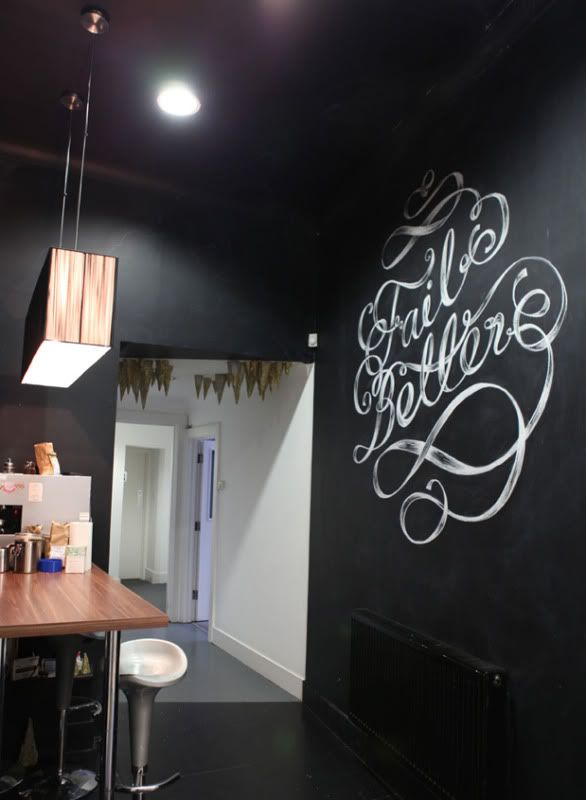
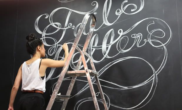
Fail Better Chalk Mural

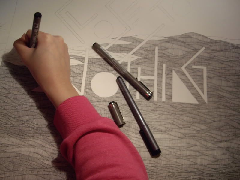
As part of their "Live From The Kitchen" series HiRes! London invited me to create a chalk illustration which would be live streamed on their site.
“Ever tried. Ever failed. No matter. Try Again. Fail again. Fail better.” – Samuel Beckett
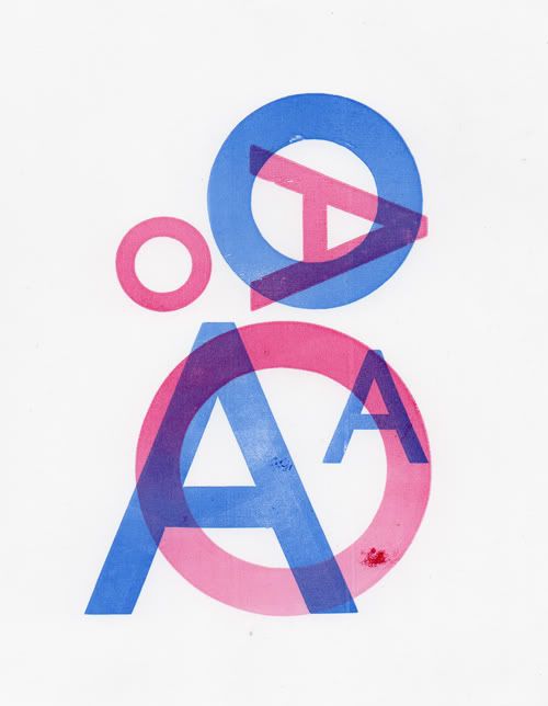
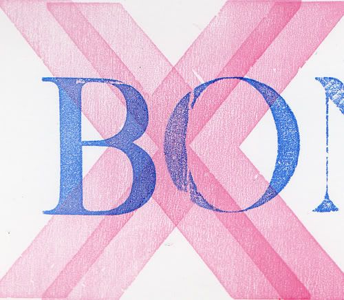
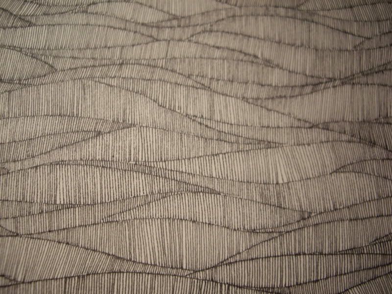
The above quote hangs in every HiRes! office so I've been told. Never having done a mural before I was a little nervous about how it would turn out but I think the end result was fantastic (especially considering the light projector failed I had to measure it all up by hand). At a whopping 3metres x 4metres it's the largest MaricorMaricar artwork to date. Below are some process pictures but check out the HiRes! site to see it come to life.

We have also printed a limited edition series of screen prints which will be available soon from our store. Out of an edition of 100 only 20 are available for sale, please get in touch if you are interested in a print.


Thursday, November 03, 2011

Back to Oz

We're counting down until we bid London farewell and head back to sunny Sydney. I'll miss this wonderful city and I hope it won't be too long before I can come back again. An endless summer sounds pretty awesome, 6 months in Sydney and 6 months this side of the globe sounds like an ideal arrangement. If only!

Before we fly out we're holding a special clearance in our BigCartel and Etsy stores. 30% of our handsewn embroideries and a 3 for 1 special on our risograph prints (BigCartel). For the 30% discount on Etsy please use this code BACK2OZ.


Makers, Dreamers: We also have a brand new poster available of our Makers, Dreamers embroidery. "We are the music makers and we are the dreamers of dreams" is a quote taken from Ode by Arthur O'Shaughnessy via the film Willy Wonka & The Chocolate Factory.

The original embroidered artwork was on display at AMV BBDO and now a limited edition of 100 A2 sized giclee printed posters are available. (please note that the posters are smaller than the original A1 sized hand embroidered poster)

A2 posters (including 12mm border) hand numbered and signed. Printed on Hahnemueller Photorag paper using archival inks

Posters will be mailed rolled.

Thursday, September 29, 2011

Mr Postman

We've just arrived back to a surprisingly sunny London after a week road-tripping around Scotland. A proper roundup of what we got up to will come soon but in the meantime here is a belated post about a few special deliveries that arrived in the mail recently.

The letterpressed wedding invitations I designed for our big sis and her fiancé arrived all the way from Sydney safe and sound. The tactile and warm touch of letterpress printing fit in beautifully with the vintage theme they've chosen for their wedding. They went with Crane Lettra 300 GSM in Pearl White and Kraft brown envelopes with their own custom envelope liners.

We were also gobsmacked to receive another invitation... for a reception at Buckingham Palace hosted by The Queen and The Duke of Edinburgh! The reception will be in October to celebrate The Queen's upcoming tour of Australia. We have British Council Australia and Realise Your Dream to thank for this incredible invitation. 

It's pretty random, I didn't think we'd be attending any formal event while we were in London, let alone a reception at Buckingham palace, so I didn't pack anything appropriate in my suitcase. Been busy hunting for formal "Day Dress" wear but we're having trouble finding anything that fits. And ideally we'd love to wear an Australian design in keeping with the theme of the event but that's proving a little difficult. Unfortunately we can't take a camera in with us but we'll try to soak it all in and report back.


Thursday, September 01, 2011

Summer/Autumn and "Back to the Start"

There's now a chill in the air and the blazing sunsets we've come to expect have faded away to ones
that are grey, white and pale. Brrrr, luckily we're going to skip the northern winter and will be home in time for summer in Sydney. We realised we have less than 3 months though before we head back so we're cramming in all the things we kept putting off: galleries, museums, cafes and curiosities. We jotted them all down and each week we have a lucky dip. Our fist pick was the flower markets at Columbia Road where we enjoyed a leisurely Sunday of people watching and flower hawking and came away with a chili plant and some thyme. But not as successful, was our trip to the Natural History Museum. We got diverted by heavy rain and a sea of children to the bedlam that is Harrods on a wet weekend in London. Some things I learnt that day – avoid museums during the summer holidays especially on a weekend, Harrods is crazy and somewhere I need not visit again and I'm very picky about my almond croissants. Since then we've had trips to St Bride's Printing Library, Victoria Park, Brick Lane Sunday Markets, Rough Trade and No Brow which have all been a lot more exciting.

Below are some of the goodies we picked up from the No Brow store. Everything We Miss by Luke Pearson, Flesh and Bones: A Colouring Concertina by John Sibbick and Rise & Fall by Micah Lidberg. A place you must visit if you're in London, No Brow are independent publishers that work with graphic artists and illustrators to produce exquisitely tactile printed works. They have a show coming up in September that looks like it will be pretty awesome. Masks is an exhibition of works from Ben Newman and it opens on the 15th of September.


And lastly here are some stop motion animations that have blown our minds lately. Johnny Kelly from Nexus Productions beautifully crafted stop motion animation "Back to the Start" has just gone live. There's a behind the scenes here and some production stills from the shoot.

And a classic animation that we were introduced to at LIAF, "Hedgehog in the Fog". Stunning, mesmerising and so technically brilliant.


Monday, July 18, 2011

Ephemera Society London Fair

One of the perks of being in London is that we are able to indulge in our love of markets, vintage and paper in one combined geek out. Our trip to the Ephemera Society's Fair was as exciting as our childhood trips to the Lollipop Shop (remember the one that used to live in the basement of the Queen Victoria Building at the top of the small escalators?). Tables upon tables of lovely printed labels, their ink still vibrant despite some of them being more than a century old, theatre bill posters advertising curiously titled shows in a jumble of typefaces.. a lot of printed matter to make a designer swoon.


Thursday, May 05, 2011

Show n' tell

I finally got around to scanning and photographing what co and I got up to at our class the other week so we've got a bit of show and tell for this week's post. The second day of letterpress class saw us work with wooden type to create 2 colour overprints. I played around with 'O' & 'As' while co got a bit tricky with her prints and offset her overprint to create a really nice xx pattern.

On our third and last day our project was to create fantasy business cards. I really love the new cards Hungry Workshop created for us so thought of creating a limited edition UK souvenir batch using one of our favourite catch cry mottos printed onto our existing cards.

Last weekend we headed to the Ephemera Fair on the lookout for vintage craft books, embroidered greeting cards and anything typographic and we didn't come home disappointed. I eyed some embroidered cards that I found at the very first table I found myself at. I though really hard about whether I could afford one (or maybe two) but contented myself with just the small booklet of stitches. We went on to discover a friendly retired printer that had an amazing collection of printed ephemera, antique labels that were as vibrant as the day they were printed. We also found another embroidery book and this lovely patterned annual report for the Society of Compositors. I thought the title referred to musical composers until co explained it meant type compositors/printers which explains the awesome printing.


Tuesday, April 19, 2011

The Hungry Workshop are awesome

For our trip to London we really wanted to get some proper cards done (finally!) and wanted to do something a little special and something fitting to the tactile work we do. Luckily we stumbled across the letterpress work of The Hungry Workshop run by the awesome duo Simon and Jenna. Letterpress is something we've been dying to try as we've been interested in printmaking for a long time (we did a short course in stone lithographic printing at COFA a few years back and we've booked ourselves in for a letterpress course at Central Saint Martins while we're in London which started yesterday - so much amazing stuff to share about the class so we'll make sure to write a proper blog post about it after it wraps up).

Please check out their site, it's chockas with some amazing prints they've collaborated on with other designers as well as custom designs they have created themselves. They were tremendously helpful with getting our business cards done and ready in time for our trip and we couldn't be more happier with the results. Below are the cards, we chose an uncoated, thicker card that suited the handcrafted feel of our work.

Beer Matt Board 390gsm
Pantone Black 5


Saturday, October 16, 2010

Rizzeria

Ca and I checked out an awesome printing collective in Sydney called Rizzeria this week. We were looking for a printer to make some posters of our black and white illustrations for the group show ABD6 (which opens tomorrow at Kinokuniya books in the city). And can I just say the prints look frak'in good, I was a bit worried that the fine lines so close together would look like a mess but the details held up real good. How can I describe riso prints??? It's in between screen printing and photocopying if that makes any sense... We are planning on doing a whole lot more experimenting with risographs, illustrations and posters which take advantage of the process, I can't wait to start!


Monday, July 19, 2010

New type work

We're busy on some new type work and patterns, here are some bits and pieces. We're working on a new series called "Phrases of Speech" all based on twisted idioms and turns of phrase that Ca and I are guilty of dropping into conversations now and then. "Get All Up In My Goat" is a classic example of me getting my phrases mixed up. It's a mash up of "All up in my grill" and "Gets my goat" and was the inspiration for this series.

"You gotta keep cheering" is sort of like our motto. I scribbled the line down in my notebook a few years back after hearing it chanted at a BSS gig in Sydney. It might seem a bit egotistical (it was Keven Drew chanting it out to the crowd) but it was really the opposite. On the night he was feeding off the energy of the crowd, who were really into the gig, and feeding it back into the show. And not wanting it to stop, anyway, I thought it was a cool motto. Still undecided about the type treatment, kind of needs to have more energy or be more loud to suit the sentiment. Will keep at it and post up what we end with.


Sunday, July 18, 2010

Sydney Design: Designer Disco


Co and I are just about finished creating our lightbox design for Designer Disco. "Australian INfront is extremely excited about bringing the Designer Disco to life with the record label Future Classic. This offshoot of Future Classic’s insanely popular underground clubnight Adult Disco burns the disco flame until late, late, late. Meanwhile, in the laneway behind the venue, an exhibition of lightbox artworks illuminate and enlighten. The array of cutting-edge Sydney designers involved include Alter, Future Classic, Greedy Hen, Leif Podhajsky, Like Minded Studio, Miricro/Maricar, Sensory,
Sopp Collective, String Theory, Toko and We Buy Your Kids."

10pm till late, Saturday 14 August
The Civic Hotel & laneway, 388 Pitt Street
Cost: $15

There's a typo in our name (we're Miricro/Maricar) nevertheless we're excited to take part along side these awesome designers. Here are some process shots of our design.

/ca


Wednesday, March 17, 2010

Global Village pitch artwork

Sorting out some old work and came across some concept art for the Global Village cd artwork that didn't get used in the end. Created while at Mathematics.

/ca

Thursday, March 11, 2010

Global Village compilation artwork - Americana, Balkans & Caribbean

CD artwork for the third instalment of the SBS/Universal series of Global Village compilations. Created for Mathematics.

Wednesday, January 20, 2010

Justine Clarke 'Songs to Make You Smile'

We created the following videos for Justine Clarke's second DVD release 'Songs to Make You Smile' while at Mathematics. The design package also included the DVD cover and internal artwork as well as the DVD menus, bumpers and credits.

Art direction, illustration and animation for 'Imagination', Creatures of the Rain and Sun', 'Songs to Make You Smile', 'Doin' It', 'Witches Ball' and DVD menu and credits by Maricor and Maricar. Animation for 'Dinosaur Roar' by Maricor and all live action directed by Mathematics.

Animations will be posted up soon, in the meantime here are some stills from the videos and the album art.


Monday, January 18, 2010

Global Village compilation artwork

Series of illustrated covers we designed and art directed for the SBS/Universal
"Global Village" compilations while at Mathematics. We developed the branding 
from the logo design through to the series roll-out.


Eskimo Joe - 'Inshalla' album and 'Foreign Land' single Artwork

Album and single artwork for Eskimo Joe's Inshalla album, done whilst at Mathematics.
The cover art for Inshalla was nominated for best cover art in the 2009 Aria Awards!