Showing posts with label pattern. Show all posts
Monday, September 30, 2013
Etsy update
Hello! We've just updated our etsy store with some of our original hand embroideries, new giclee prints and embroidered totes and pincushions. There's a mix bunch of lettering pieces as well as the epic battles we created for Pick Me Up London waiting for a lovely new home. Below are some of the new pieces available.


Thursday, August 01, 2013
Dream Weavers part II
Sorry forgot to add these process images in the last post. These are from the embroidery stage. Sometimes the backs are just as interesting as the front. The first image is where it all starts, transposing the design by hand onto fabric. It was a bit of an arse to do for this project. Because of the detail in the pattern I had to be quite precise and ended up pinning the fabric to the design so I could be sure the weave matched up. With needlepoint fabric the weave's usually quite clear but we used a fine linen and I nearly went blind and cross-eyed doing it!
Wednesday, July 31, 2013
Dream Weavers
It's been a while since we've posted process but an embroidery project we completed earlier in the year has gone live so I thought now would be a great time to go through a project from sketch to final embroidery. The project was for SHOP magazine and their Madrid and Barcelona shopping guide, which came to us through UK based studio Design by St and our UK illustration agency Handsome Frank. The brief was to create a patterned graphic inspired by the contemporary rug designers based in Madrid and Barcelona that are featured in the issue.
It was a wonderful project that allowed us to play with patterns but was also a little tricky. We knew we had to somehow work the title Dream Weavers into the pattern but we weren't sure how obscure the text could be. The first briefing mentioned perhaps hiding the title within the pattern which we tried to push in some of our earlier concepts but had to bring that back a bit for legibility. In the final design we opted for a traditional sans serif font but used contrasting colours in the stripe design to suggest the type being woven back into the pattern.
You can see two of our first round ideas in the top image, a very rough preliminary sketch next to the final design chosen and lastly the final embroidery. With this project most of the design was worked up in Illustrator with just that rough sketch as guidance for some pattern structures and you might notice a minor difference between the final digital version of the design and the embroidery. We had to undo one panel to help with the legibility of the subline. It was a minor change so no biggie but still makes you wish there was a control Z embroidery equivalent handy!
So that was that project, I hope seeing some of our process is helpful, I know I personally find it fascinating to glimpse into other illustrators/designers/artists/makers process. If you follow us on instagram (maricormaricar) we post up some process/wips/inspiration, much more regularly than we update this blog (sorry it's not as often as we'd like). And i'm also very please to share that Maricor and I are taking part in Studio Pop Ups which is being presented by the Powerhouse Museum as part of Sydney Design 2013. We're not used to holding market type stalls but we'll have a mini version of our studio space set up with some originals and prints on display and for sale. We also have a few bits and bobs we're making for the pop up - some pin cushions made with fabric remnants from our Maps series of patchworks as well as some tote bags we're embellishing with hand embroidery.
There will be pop ups hosted by a nice mix of designers such as Emily Green and Limedrop. More information is up on the Pop Ups page here and it will run from the 15th - 18th August 10am-5pm. We'll have some current projects that we'll work on during the pop up so if you're interested in learning more please pop down for a chat!
It was a wonderful project that allowed us to play with patterns but was also a little tricky. We knew we had to somehow work the title Dream Weavers into the pattern but we weren't sure how obscure the text could be. The first briefing mentioned perhaps hiding the title within the pattern which we tried to push in some of our earlier concepts but had to bring that back a bit for legibility. In the final design we opted for a traditional sans serif font but used contrasting colours in the stripe design to suggest the type being woven back into the pattern.
You can see two of our first round ideas in the top image, a very rough preliminary sketch next to the final design chosen and lastly the final embroidery. With this project most of the design was worked up in Illustrator with just that rough sketch as guidance for some pattern structures and you might notice a minor difference between the final digital version of the design and the embroidery. We had to undo one panel to help with the legibility of the subline. It was a minor change so no biggie but still makes you wish there was a control Z embroidery equivalent handy!
So that was that project, I hope seeing some of our process is helpful, I know I personally find it fascinating to glimpse into other illustrators/designers/artists/makers process. If you follow us on instagram (maricormaricar) we post up some process/wips/inspiration, much more regularly than we update this blog (sorry it's not as often as we'd like). And i'm also very please to share that Maricor and I are taking part in Studio Pop Ups which is being presented by the Powerhouse Museum as part of Sydney Design 2013. We're not used to holding market type stalls but we'll have a mini version of our studio space set up with some originals and prints on display and for sale. We also have a few bits and bobs we're making for the pop up - some pin cushions made with fabric remnants from our Maps series of patchworks as well as some tote bags we're embellishing with hand embroidery.
There will be pop ups hosted by a nice mix of designers such as Emily Green and Limedrop. More information is up on the Pop Ups page here and it will run from the 15th - 18th August 10am-5pm. We'll have some current projects that we'll work on during the pop up so if you're interested in learning more please pop down for a chat!
Monday, July 15, 2013
MAPS opening
Pheew I'm very pleased to say that our MAPS show is now up at Koskela. True to form there was some last minute up all night nimble needle work to get the last piece finished but it was all worth it. The opening was last weekend but the exhibition runs until August so there's still plenty of time to see it if you're Sydney based. Unfortunately I was in a rush and arrived late to the opening, so was a little frazzled and didn't take any photos on the day. But we did take some photos during the install and will try to get some pics of the show before we take it down. Many thanks to Kate at Koskela and M for all their help measuring out positions, hammering and ladder climbing. Below are the main patchworked wall hangings and the one we've nicknamed the long sock.
There is also a little extra side show in the nook with some of the pieces we created for Pick Me Up earlier in the year. You can see some of the Epic Battles and our Aim to Misbehave piece.
We also had some great write ups on the show on Inside Out magazine's blog, Desktop and Broadsheet Sydney.
PS You can see some more of our workspace ie my lounge room in the Broadsheet Sydney feature.
There is also a little extra side show in the nook with some of the pieces we created for Pick Me Up earlier in the year. You can see some of the Epic Battles and our Aim to Misbehave piece.
We also had some great write ups on the show on Inside Out magazine's blog, Desktop and Broadsheet Sydney.
PS You can see some more of our workspace ie my lounge room in the Broadsheet Sydney feature.
Tuesday, June 18, 2013
Maps solo show
We're very excited to invite you to our solo show which is being held at Koskela in July.
It will be a little different to the works we've exhibited recently since we wanted to work with new techniques and at a larger scale. The pieces are abstract embroideries and patchworks inspired by our stay in London in 2011. We were fortunate to live just near London Fields park so there were no other high rise buildings for a good distance and living on the 10th floor gave us an amazing panaromic view of London (we were extremely lucky to find that apartment the universe must have thought we were due a break!). Each day and night we were treated to an amazing study of colour through our windows. We tried to document the different coloured skies and the palettes chosen for these new works are based on those photographs.
The show opens at Koskela 6 July from 2-3.30pm and runs until the 18th August
Koskela // 85 Dunning Avenue, Rosebery, NSW 2018 // 9280 0999.
There will be some refreshments and nibbles kindly provided by Koskela/Kitchen by Mike so hope to see you there!
And a few previews..
Sunday, May 05, 2013
Prick show
Last weekend with much excitement we headed to a cactus and succulent show. A good friend has gifted us most of our cacti and succulents and got us hooked on them and we were keen to add to our collection. This was our first time going to the show though so we weren't prepared for the awesome amount of weird, spiky, hairy, bulbous specimens on display. I forgot to take the camera so these are just iPhone pics but look at those textures! We also walked around Eden Gardens which hosted the show. It's huuuge and a little overwhelming so I didn't get to look at it all properly but I spotted some lovely patterned leaves.
Tuesday, January 22, 2013
Drifters
We went on a camping trip last week to Myall Lakes, north of Sydney and pitched our tents in a beautiful spot right between beaches and the lake. We're in the height of summer and bushfire season in Australia so we had to make do without a campfire. Luckily we had cooking facilities not to mention eco toilets so while we weren't entirely glamping we did have some home comforts (we also brought our stove top coffee maker and an air bed...) For my second camping attempt I think we did pretty well although we completely overestimated how much food we'd need and as a result have half a years worth of Spam and canned meals to go through.
It was a great holiday spent with some of our closest friends (thank you G for battling gastro to make it). I hope it becomes more of a tradition and that next time we'll be able to take Ava along. Would love for her to enjoy growing up with summers swimming in the lake, climbing trees and sleeping under the stars.
Below are some rock and shell textures i've been collecting over the summer. I call them drifters.. maybe that's the theme for this year? I've always liked planning and timing things. That all sort of flew out the window when Ava surprised us, maybe drifting is something I should try to embrace more, even for just a little while.
PS and just for fun some light painting photos we took on the first night..
Friday, May 18, 2012
As Prescribed - Fine Lines
As Prescribed is an artist driven t-shirt label that aims to be a platform for exposing artists and designers to the universe. Founded by Melbourne based illustrator Eveline Tarunadjaja and designer Nick Parker, As Prescribed takes on the form of an art gallery, in an online retail environment. The awesome folks behind new T-shirt label As Prescribed invited MaricorMaricar to take part in their first artist series "Fine Lines". The series of shirts also feature designs by Eveline Tarunadjaja, Sean Morris and Kubota Fumikazu.
The label launched last week with a pop up shop and exhibition at No Vacancy gallery in Melbourne. Head down and say hello to Eveline, she's super nice and until the 20th of May visitors to the gallery get $10 off shirts.
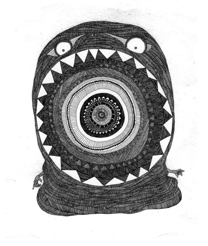
Our piece is titled "The Hungry Slug" and this little monster and some of his gang are currently on display in the exhibition as well as a couple of original hand sewn embroideries and our print "Makers, Dreamers" which is available for sale during the exhibition.
Each artist has a nice little interview up on the As Prescribed site, here's our one, we were pretty nervous on camera and kept pulling faces!
Wednesday, December 14, 2011
WIRED Magazine 12 11
Hello, we're back! We touched down in Sydney a couple of weeks ago and have since then gorged ourselves on summer fruits and catch ups with friends and family. We're in between studio spaces and rentals but have managed to set up desk spaces at least. It's funny how having even a bit of space to yourself helps you feel settled.
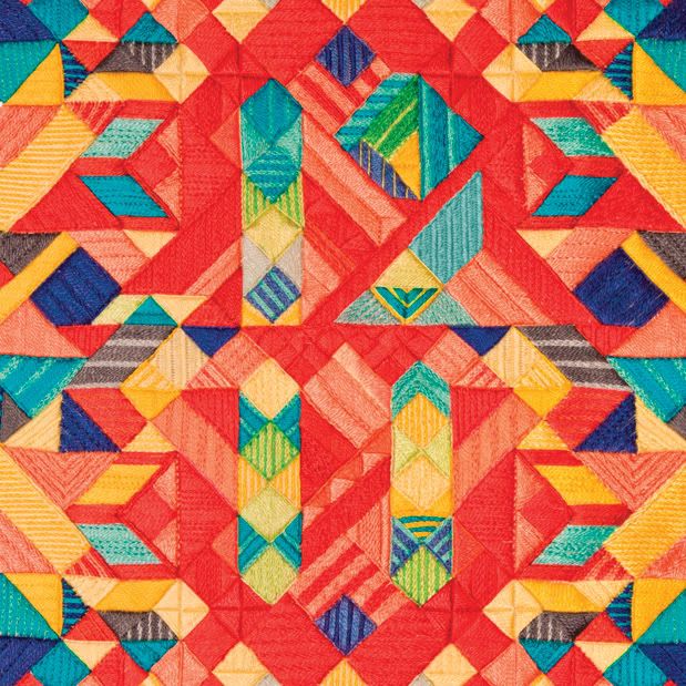
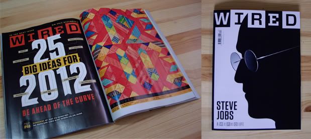
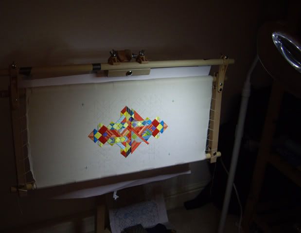
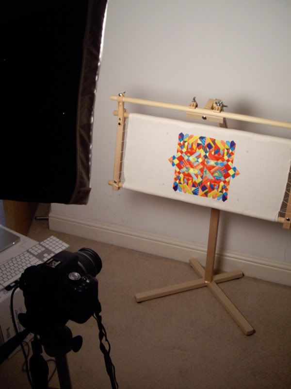
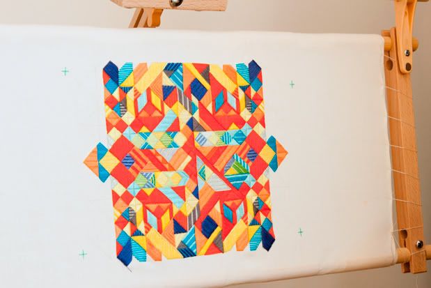
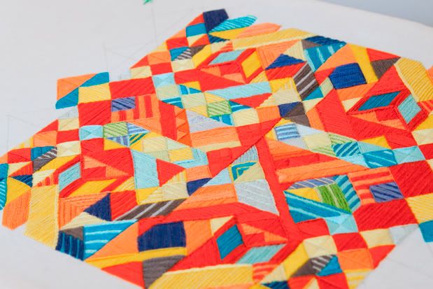
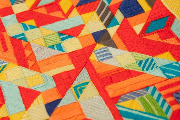
It's been a while since we posted regularly so we have a few projects to share that we'll post about steadily. Firstly we can finally share an embroidery we created for WIRED magazine's December issue which we completed around June. It's for the features introduction page and includes the numbers 12 and 11. For iPad users this embroidery is animated too as a nice little bonus. The piece took about 185 hours to complete. A huge task as the whole surface was covered with needlework and while we were embroidering we were also capturing photographic stills to build the animation.
There were a few changes to the final embroidered piece, colours were changed and tweaked. Once it was completed we realised that the 12 and 11 got a bit too lost in the pattern so we swapped in a few more red tiles into the mix. Normally we would have unpicked the tiles and sewn in the new colour but as we had animated the piece as it progressed this option wasn't feasible. Instead we digitally tweaked the colours frame by frame.
We were lucky our apartment was high up or else neighbours might well have wondered why our windows were boarded up. The makeshift studio we set up at one end of my bedroom needed to be completely blacked out for the photography. A bit of a shame we worked on the piece right in the middle of the London summer, we hardly got a chance to enjoy the sunshine.
It's been a while since we posted regularly so we have a few projects to share that we'll post about steadily. Firstly we can finally share an embroidery we created for WIRED magazine's December issue which we completed around June. It's for the features introduction page and includes the numbers 12 and 11. For iPad users this embroidery is animated too as a nice little bonus. The piece took about 185 hours to complete. A huge task as the whole surface was covered with needlework and while we were embroidering we were also capturing photographic stills to build the animation.
There were a few changes to the final embroidered piece, colours were changed and tweaked. Once it was completed we realised that the 12 and 11 got a bit too lost in the pattern so we swapped in a few more red tiles into the mix. Normally we would have unpicked the tiles and sewn in the new colour but as we had animated the piece as it progressed this option wasn't feasible. Instead we digitally tweaked the colours frame by frame.
We were lucky our apartment was high up or else neighbours might well have wondered why our windows were boarded up. The makeshift studio we set up at one end of my bedroom needed to be completely blacked out for the photography. A bit of a shame we worked on the piece right in the middle of the London summer, we hardly got a chance to enjoy the sunshine.
Thursday, September 15, 2011
Defeat Deflector & Makers, Dreamers
Just a quick post about a couple of works we have out and about in London. We've donated "Defeat Deflector" (a piece from the "Turns of Speech and Figures of Phrase" show that we held in March) to Artarama where it will be auctioned off to raise funds for Age UK and the White Ribbon Alliance. Artarama is organised by Karmarama London and the show/auction is on the 7th of October. There'll be exclusive work by Rankin, Rob Ryan, Al Murphy and many more.
We have also completed a new embroidery called "Makers, Dreamers" which is on display at AMV BBDO as part of a typographic group show. "We are the music makers and we are the dreamers of dreams" is a quote taken from Ode by Arthur O'Shaughnessy via the film Willy Wonka & the Chocolate Factory.
This is our largest to date, 841 x 594 mm. I'm not sure exactly how much thread that amounts to, but I bet it's something crazy. The original A1 sized artwork is available for sale, please email us if you're interested. A limited edition of 100 giclee printed posters are also available for £45, A2 in size, hand numbered and signed and printed on Hahnemueller Photorag paper using archival inks (please note that the posters are smaller than the original A1 sized hand embroidered poster). Please email us if you would like more info. The posters will be available from our Big Cartel store soon.
We have another group show that we'll be taking part in later in the year. It's a tribute show for Jim Henson at Gallery Nucleus in the States. Look out for some Sesame St flavoured "Sweater Letters" and a Choc Chip C. Other artists include Cat Rabbit, Isobel Knowles and a fellow Handsome Frank artist Helen Musselwhite. Can't wait to see what these talented ladies create!
And I almost forgot, we have a new Sweater Letter. We're slowly going through the alphabet and filling in the gaps. For "B" I've been influenced by the clashing colours of 80's knitwear. This is also available from our Big Cartel store. We're making our new Sweater Letters available as limited editions of 3, each one will still be hand embroidered so there may be slight differences.
** Update: I've signed and numbered (handstitched) the B Sweater Letter piece **
We have also completed a new embroidery called "Makers, Dreamers" which is on display at AMV BBDO as part of a typographic group show. "We are the music makers and we are the dreamers of dreams" is a quote taken from Ode by Arthur O'Shaughnessy via the film Willy Wonka & the Chocolate Factory.
This is our largest to date, 841 x 594 mm. I'm not sure exactly how much thread that amounts to, but I bet it's something crazy. The original A1 sized artwork is available for sale, please email us if you're interested. A limited edition of 100 giclee printed posters are also available for £45, A2 in size, hand numbered and signed and printed on Hahnemueller Photorag paper using archival inks (please note that the posters are smaller than the original A1 sized hand embroidered poster). Please email us if you would like more info. The posters will be available from our Big Cartel store soon.
We have another group show that we'll be taking part in later in the year. It's a tribute show for Jim Henson at Gallery Nucleus in the States. Look out for some Sesame St flavoured "Sweater Letters" and a Choc Chip C. Other artists include Cat Rabbit, Isobel Knowles and a fellow Handsome Frank artist Helen Musselwhite. Can't wait to see what these talented ladies create!
And I almost forgot, we have a new Sweater Letter. We're slowly going through the alphabet and filling in the gaps. For "B" I've been influenced by the clashing colours of 80's knitwear. This is also available from our Big Cartel store. We're making our new Sweater Letters available as limited editions of 3, each one will still be hand embroidered so there may be slight differences.
** Update: I've signed and numbered (handstitched) the B Sweater Letter piece **
Subscribe to:
Posts (Atom)