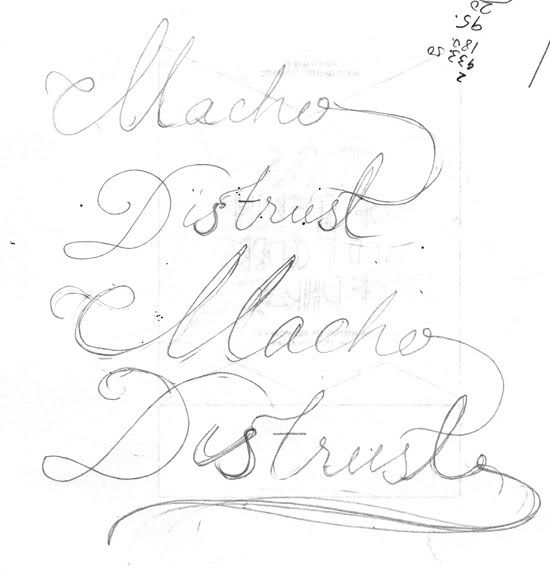
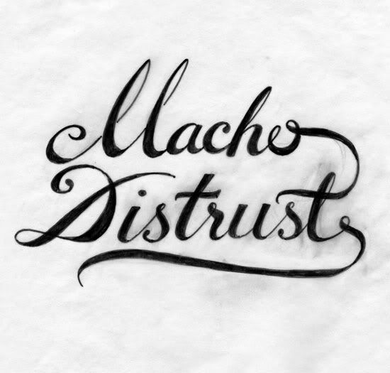
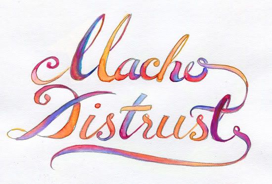
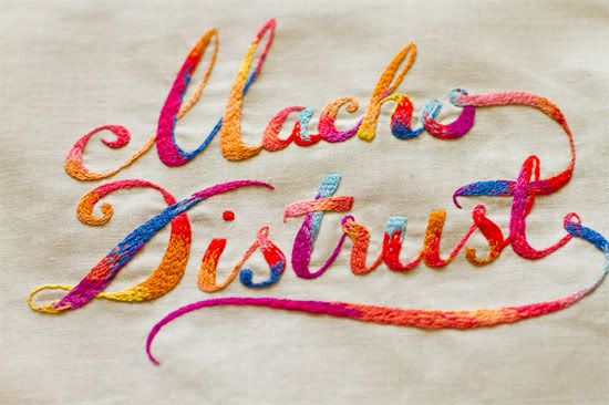
Thought it would be nice to share some of our process work in the lead up to our exhibition. I really enjoy 'making-of' videos and looking at process work and seeing how ideas develop. Not to mention it's always great when artists/designers share tips, I hope we can do the same.
This piece is one of co's and is inspired by Blondie. The words aren't meant to be taken too seriously. We were drawn to them because our work has often been described as cute, feminine etc and we used to think that was a bad thing. We've realised we do what we do, trying to act differently (in this case macho) or be something else is a waste of energy and also maybe insincere. I was reminded of this after reading a blog post by Lilly Piri this morning.
Co worked up the type in a series of pencil and pen sketches. The type is then refined using water colours with some adjustments in Photoshop. Sometimes we'll start a piece knowing what colour combinations we'd like to use but the water colours help add some randomness and some interesting gradients we'd not usually use.
skip to main |
skip to sidebar

 Posts
Posts

 Posts
Posts
- MaricorMaricar
- Makers of Things assorted. Embroidered illustrations, lettering, animation, & design. And sometimes all at the same time.
Twin-sized studio that create bespoke hand crafted visuals for print and motion. For our full portfolio please visit us at our site www.maricormaricar.com
Represented by Jacky Winter - Australia www.jackywinter.com
Represented by Handsome Frank Illustration Agency- Worldwide www.handsomefrank.com
Twitter @maricormaricar
© MARICORMARICAR. ALL RIGHTS RESERVED
Pleased to meet You!
If you have a project you'd like to discuss please email us at hi@maricormaricar.com. We're available for freelance or contract. We have a few pieces for sale on Etsy but if you are interested in a custom artwork we do take personal commissions, please email us.
Search This Blog
Subscribe To


Labels
- album art (7)
- animation (22)
- book cover (1)
- embroidery (52)
- exhibition (52)
- family (2)
- hand made (61)
- illustration (87)
- inspiration (22)
- lettering (47)
- lithops (1)
- lithops seedlings 2013 (1)
- London (20)
- magazine (2)
- miniatures (8)
- motion (19)
- music (25)
- music video (9)
- patchwork (1)
- pattern (28)
- pick me up (1)
- plantlife (7)
- polaroids (4)
- poster (13)
- press (11)
- print (17)
- prints (5)
- process (6)
- props (5)
- shirt (1)
- stop motion (11)
- studio (20)
- travel (16)
- wall hanging (1)
- website design (8)


7 comments:
gorgeous! so nice to see this process.
love the peek of the little guy below too.
Found your web site off of The Cutting (& Stitching) Edge. I'm so glad! Truly beautiful work: creative, modern, tasteful. Thanks so much for taking the time to share your work!
i love it when artist show their process, it makes things real!! great work!
beautiful work!!! I am in awe of your patience and skill!
That is so beautiful and interesting..I love the colors!
oh my goodness...your work is incredible!! I'm a bit awestruck x
Thanks for all the lovely words! Water colours are so tricky to get a hang of but choosing the colours is always a fun part of the process.
Post a Comment