Tuesday, September 06, 2011

Denim and Weave

Denim is tough! As part of the Denim group show we were invited to take part in curated by Dell Stewart, we came across a few road bumps. Finding the right cloth and technique that would work well with the fabric was a matter of trial and error and was just as frustrating as searching for the perfect pair of jeans. The Cloth House on Berwick St have a great selection of denim cloth but we were still umming and ahhing about the amount of fade we wanted and the texture of the fabric. We wanted something that looked a bit lived in (we even contemplated looking for a second hand denim jacket but couldn't find one with a large enough clear piece of denim), the right shade of blue and we needed it supple enough that we could sew onto it.

Below are some photos of the final piece called Echo. In this piece, threads harvested from the denim are embroidered back onto the cloth and re-combine with denim. The aspect of denim that we were intrigued by is its specific tactility, the way it embodies the history of its use. We wanted our marks although recent to be absorbed into the fabric through the use of denim on/within denim.

Echo
203mm x 203mm
Denim, cotton thread


We also recently took part in a group show in Sydney called Alphabet Soup. Presented by Art on the Wall and Weave it was a celebration of letters and literacy. All the works have been donated by the artists involved and proceeds go towards the charitable programs organised by Weave. They provide support for disadvantaged groups in the community and the funds raised will go towards the mentoring and tutoring programs they offer.

Each artist created a collection of 3 letters for the show. We really wanted to do a new piece with paper so for our K, M and R we experimented with patterns and layering.


Thursday, September 01, 2011

Summer/Autumn and "Back to the Start"

There's now a chill in the air and the blazing sunsets we've come to expect have faded away to ones
that are grey, white and pale. Brrrr, luckily we're going to skip the northern winter and will be home in time for summer in Sydney. We realised we have less than 3 months though before we head back so we're cramming in all the things we kept putting off: galleries, museums, cafes and curiosities. We jotted them all down and each week we have a lucky dip. Our fist pick was the flower markets at Columbia Road where we enjoyed a leisurely Sunday of people watching and flower hawking and came away with a chili plant and some thyme. But not as successful, was our trip to the Natural History Museum. We got diverted by heavy rain and a sea of children to the bedlam that is Harrods on a wet weekend in London. Some things I learnt that day – avoid museums during the summer holidays especially on a weekend, Harrods is crazy and somewhere I need not visit again and I'm very picky about my almond croissants. Since then we've had trips to St Bride's Printing Library, Victoria Park, Brick Lane Sunday Markets, Rough Trade and No Brow which have all been a lot more exciting.

Below are some of the goodies we picked up from the No Brow store. Everything We Miss by Luke Pearson, Flesh and Bones: A Colouring Concertina by John Sibbick and Rise & Fall by Micah Lidberg. A place you must visit if you're in London, No Brow are independent publishers that work with graphic artists and illustrators to produce exquisitely tactile printed works. They have a show coming up in September that looks like it will be pretty awesome. Masks is an exhibition of works from Ben Newman and it opens on the 15th of September.


And lastly here are some stop motion animations that have blown our minds lately. Johnny Kelly from Nexus Productions beautifully crafted stop motion animation "Back to the Start" has just gone live. There's a behind the scenes here and some production stills from the shoot.

And a classic animation that we were introduced to at LIAF, "Hedgehog in the Fog". Stunning, mesmerising and so technically brilliant.


Tuesday, August 16, 2011

Looming + Odd & The Nimble

Hello, just a quick post about my first weaving - Co keeps mixing it up and calls it looming, hehe - project on the rigid heddle loom I received for my birthday (thanks M!). I love puzzles so had a fun night assembling it. I was a little impatient and didn't follow the instructions properly and bought knitting yarn (which I was told expressly not to use) as I could easily buy some nearby. The end result is a scarf that looks and feels a bit like a hessian sack! Luckily after a wash it has softened a bit but I'll be sure to source proper weaving yarn for the next project.

Our good friends Sam and Esther have also just launched their new online store, Odd and the Nimble, selling lovely handmade jewellery and home wares as well as prints. Please do check it out!


Tuesday, August 02, 2011

Gusto Gusto!

There are a handful of words to describe rice in the Filipino language. There's a word for unmilled rice, milled rice, cooked rice, rice porridge, burnt rice, leftover rice, fried rice, and rice muffin...but today's post isn't really about rice. It's about a play on words. Well actually just the one word. Gusto.

Our new embroidery is Gusto Gusto! (pronounced goo'sto gus'to!) and it's a play on the Filipino word gusto (want) and the English word gusto (enthusiasm, zest, energy).

"I want energy" sounds a little lame, but Gusto Gusto! has the right motivational tone don't you think? This was a little phrase I had written down in my notebook a while ago and is another motivational typographic piece along the lines of "You Gotta Keep Cheering". Sometimes you need a little helpful reminder to keep going, don't give up, be persistent. One day Ca and I will create a series of these type pieces and we're going to call it "Say SO'S".

Anyway I've rambled a bit, here is the finished piece which is available from our Big Cartel store. And below are some pictures of the tools we've used. Most of the process we share on this blog has focused on the creative side of things but I thought we'd share a little insight into the equipment we use to create our sewn illustrations. People have asked if our embroideries are hand sewn or machine done (every piece is entirely hand sewn) so we thought it might be interesting to share with you the tools we use.


We began sewing using an embroidery hoop, crewel needles and cotton embroidery floss and calico. And this really hasn't changed much, save for a couple of modifications to the hoop. We've also just bought an embroidery stand and a larger scroll bar frame which we've used for a recent project but most of the time a simple embroidery hoop has been adequate. In the process photo below you can see the hoop clamped onto the frame which is an Elbesee Posilock standing frame.


One helpful tip with the hoops is to bind them, we found the tip through Mary Corbet's site Needle 'n Thread. This is a great site for anyone learning embroidery and as self taught embroiderers we've definitely found it useful. Binding helps protect the fabric and prevent it shifting as you work. We still use the first plastic hoops we learnt on and while they're cheap and great for beginners, they have a tendency to mark the fabric which doesn't come out after washing. Perhaps we pull the fabric too tight and damage the threads in the weave, but sometimes a ghost of a circle is left on the fabric even though we have made sure to take the fabric out of the hoop after each sewing session. So to avoid this marking, wind ribbon or scrap material over the plastic and it's good to go. No marks and the fabric fits more snugly in the frame without having to pull on it too tightly. A bit of a geek confession but we feel a bit bad-ass wrapping our hoops like we're preparing for a boxing match :)

Tuesday, July 26, 2011

"Denim" group show at Mr Kitly

Quick post about a group show Maricor and I will be in called Denim. It opens at Mr Kitly in Melbourne on the 5th of August. We had a few aches and pains with this one and started again a few times. Denim was a surprisingly hard fabric to work with, we originally wanted to source a faded and used item of denim clothing but were afraid we wouldn't be able find one that would yield a large enough piece of fabric so we opted for a new piece from the Cloth House. The denim was not as kind on the cotton floss we usually use (it damaged the fibres whenever the thread was pulled through the fabric) so we devised a way to harvest threads from the denim to work back into it.

We wish we were in Melbourne for the show, the piece by Renilde on the flyer is amazing. More info on the show can be found at this blog http://ruggedcottontwill.blogspot.com/.
Thank you Dell for asking us to take part!


Monday, July 18, 2011

Ephemera Society London Fair

One of the perks of being in London is that we are able to indulge in our love of markets, vintage and paper in one combined geek out. Our trip to the Ephemera Society's Fair was as exciting as our childhood trips to the Lollipop Shop (remember the one that used to live in the basement of the Queen Victoria Building at the top of the small escalators?). Tables upon tables of lovely printed labels, their ink still vibrant despite some of them being more than a century old, theatre bill posters advertising curiously titled shows in a jumble of typefaces.. a lot of printed matter to make a designer swoon.


Wednesday, July 06, 2011

Mr. Jimmy and the Riomaggiore skyline

"I made a huge mistake" One of my favourite lines from one of the funniest shows that should never have been axed, Arrested Development. I'm hoping all the rumours surrounding a movie release will actually turn out to be true. Sorry for going off on a tangent. This is a post about our latest embroidery, a private commission based on a Rolling Stone lyric and the reason why the images may look a bit blurry.

"Mr Jimmy" as I like to call it was the first piece we completed and sent back from London, it's also quite large. Too large to actually fit into a regular mailing envelope since we were sending it pre-stretched so I made a makeshift package for it. Paranoid that it might get damaged in transit I reinforced my handiwork and packed it pretty darn snug in layers of bubble wrap and card board and sent it off via Royal Mail. But because I was so pre-occupied about the packaging I posted it without taking any proper scans or photos. Dang!! As soon as I got home I realised my huge mistake but it was too late.

Luckily I had been sending progress snaps to the client and had taken a few pics of the finished piece for approval. Sadly most of the shots I took were out of focus happy snaps using my point and shoot Pentax and the lighting was pretty shoddy. So nothing good enough for print but scaled down the blurriness is hardly visible on the web. This is the finished piece it's roughly 40x40 cm


The palette was inspired by the colourful architecture of Cinque Terre (photo by Robert Crum, seen here on the Plenty of Colour site which is an awesome resource of inspirational projects all celebrating colour). I travelled through Europe after graduating from University and fell in love with Riomaggiore, one of the five towns. Everything about the town was magical, from the first glimpse of the clear blue sea as soon as the train clears the tunnel to the patchwork of colours of the town's architecture. It's definitely a must see if you're planning a European holiday and I'm hoping Ca and I get to revisit while we're based in London.

I knew I didn't want to use just cherry red for this artwork (a nod to another line in the lyric) and restrict the design to hues of reds and pinks. So when I came across this image on Plenty Of Colour I thought it was perfect for this embroidery. The cherry red would be mixed up and contrasted with shots of turquoise, green and yellow to create a vivid splash of colour.

I followed our usual process of sketching then inking the lettering in watercolours. Initially the design was against white but I discussed with the client the option of sewing onto black fabric to highlight the colours and give a bit of a twist to the design and I think it turned out really well.

Here is a dodgy snap of me hunched over the magnifying lamp. Besides a couple of pencil cases full of brushes, pens and tiny tubes of watercolours and Ca's sewing bag stuffed full of threads we weren't able to bring a lot of our tools and equipment over over from Sydney. So over the last couple of months we've been slowly re-stocking our "studio" with a lot of boring things like cutting matts and metal rulers and more exciting things like a loom and a standing frame (ok, only exciting for me but I get to stab sew two handed!) One of the first things we hunted down in London was a magnifying lamp to help our poor eyes. This one is a daylight lamp which is handy for night time sewing, showing truer colours.

We have more commissions that are just wrapping up so hopefully will be able to share these with you soon.


Wednesday, June 29, 2011

Process: Go Play

I mentioned earlier that i'd be posting some process from our Go Play illustration or ESPN agazine, sorry it is a bit delayed!

For this type of embroidery, loosely grouped within the Sweater Letter series which is heavily patterned block type - our process differs slightly from our other typographic pieces like Macho Distrust. Because the patterns and stitch work are quite intricate the design process is usually less organic. We plan out the patterns with as much detail as we can right from the start and set the colours for each element before putting needle to fabric.

With works like Macho Distrust we'll set a rough colour guide by going through a watercolour step but we still freestyle a fair bit. But for Sweater Letters after choosing a rough colourway from our thread library we'll then take our preliminary sketch into Illustrator to vector, enabling us to tweak the colours easily as we need. There's usually a lot of umming and ahhing over what colour should be dominant or should this colour be next to that one if it re-appears here... etc so being able to quickly undo on the computer is a godsend, the alternative being potentially unpicking a whole day's work and we'd rather not do that!


Monday, June 20, 2011

London Fields and Turner skies

Hello I thought i'd write a post about where we live here in London and share some photos. We live in a small flat in a high rise right next to the park (and also right on top of the train line). It has its quirks, one side of the flat is curved with small windows cut into the side so it feels like we're in a floating boat perched high on the 10th floor. Being so high is great, we hardly notice the trains. And also the views are wow. I've never really wanted to live in a high rise before, I used to roll my eyes whenever Michael talked about wanting a place with a view of the city. I much preferred the idea of a garden and being part of the comings and goings of your street.. but I think i've been converted.

We have an almost clear 180 degree view of London because there are no other high rises near us. When the weather is good the sunsets are amazing, fiery and dramatic. And when the weather is bad it's just as amazing. You can see whole storms wash over the city, enveloping the skyline in a shroud of fog that just as suddenly lifts. We had one day when it was crazily alternating between grey cloud and rain to blue sky and sunshine.

I'm going to miss this view. Now if only our balcony faced the west, when I want to look at the sunset I have to jump onto a chair or the kitchen counter :)


1. The view from our balcony facing central London. 
2. Some spools of vintage silk thread we picked up at a Vintage fair in Bethnal Green.
3. This was taken at around 9pm, the summer days are getting long. Sunrise is at about 4am and it doesn't get fully dark until past 10pm. The day sneaks up on you though, I think I have the whole day left to finish off work and then I check the clock and it's already 5 and time to think about dinner.

Tuesday, June 07, 2011

London. Perfect summer one day, rainy winter the next..

Hello, sorry it's been a while between posts. We had some alarming news last week concerning the flat we just rented that had us distracted and anxious for the whole of last week, but I think (and i'm trying not to relax too much in case I jinx us) that everything is going to be ok now. It was a fairly black week and I'm so glad we had some friends to talk to here and back home otherwise I don't know how we would have coped. When the dust settles we'll be able to shed more on this as I think it will be very helpful information for anyone planning to move to London and are looking to rent a place here.

Ok so with that yuck news aside, Maricor and I are very happy to be able to share some of the new work that has kept us busy since landing here. We were commissioned by ESPN Magazine to create an embroidered piece of typography. Each issue they commission an illustrator or designer to a unique GoPlay graphic. For ours we extended our family of Sweater Letters, in the next few days i'll be able to post up some of the process work behind this project. And hopefully soon we can share more information about the other commissions we've been working on. There's another music lyric that's currently en-route to the framers back in Sydney as well as another set of Sweater Letters that are almost complete.


We're also been heaps excited to be featured in a few magazines lately, Freehugs Magazine from Russia and Nice Magazine an online magazine created by Nicework studio in South Africa.

In this issue of Freehugs Magazine we were asked along with Bratislav Milencović, Alex Trochut and Teagan White to discuss hand crafted typography and its relevance today. Although each of our styles and approach to design is quite different, it was interesting to see that our motivations seemed quite similar. We all like to develop details in our work that draw the viewer in, desiring to create type that communicates something more than letters and words.

The third issue of Nice Magazine features our work alongside a bunch of amazing creatives including Coralie Bickford-Smith and Serial Cut. You can download all three issues here for free.


Bottom image: Freehugs Magazine spread, image on right hand page by Bratislav Milencović.

Tuesday, May 24, 2011

Sea Sew

We've finally unpacked our suitcases and have settled into a new home here in London, which explains why it's been a tad quiet on the blog lately. Although we didn't have much to move besides a couple of suitcases we've been busy criss-crossing town picking up stuff for the home, all the major things have been taken care of (kettle, tea and toast!) and its slowly starting to look like our place.

We've been on the look out for some brightly patterned textiles to make the place look cosy and we scored a great knitted throw from the Bethnal Green Vintage Fair on the weekend. If anyone can recommend any great second hand stores in East London we're keen to collect a few more bits and bobs for the house - crockery, cushions etc.

Besides moving we've also been busy sewing - we've got a few exciting projects we can share with you now. A limited edition pop-up book is being produced by Katana and created by the very talented Benja Harney for Kylie's Aphrodite Les Folies Tour in Australia and we've been asked to contribute some sewn illustrations for the book too. Below are some process pics and here you can read all about the making of the book. Look out for the wonderful illustrations by Jon Zhu!


A couple of weeks ago the etcc exhibition rolled into Sydney as part of the Semi Permanent design conferences. We posted a little about the exhibition earlier and here are some pics of the show. Below is our work and the creative commons licensed image that was the inspiration.  Images courtesy of aMBUSH Gallery.
We've also got an interview up on The Creative Haven where we give a bit of an insight into our work process, how we got into doing what we do and the people who inspired us in the first place. Thanks Carly for featuring our work!


Wednesday, May 11, 2011

Collect

We caught the last day of Craft Council's Collect exhibition at the Saatchi Gallery on Monday and
boy am I glad we got in to see it before it closed. I would love to collect a few of the pieces on show but alas will just have to look longingly at their websites in the meantime.

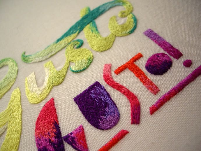
Below are a few of the artists that were standouts for me. I was taken in by the colours, patterns and textures of their works so although they are seemingly simple in their shape and form there's a lot going on when you get up real close.

Steffen Dam - Cabinet of glass curiosities. From afar his jars and glass cabinets seem to hold delicate aquatic specimens frozen behind the glass. Instead each piece is exquisitely rendered entirely in glass using a variety of techniques with some effects created through glass blowing processes that are traditionally seen as mistakes or faults.

"During my first ten years of glass making I was practicing and experimenting with all the different techniques to become a good craftsman. While doing so, I discovered a new kind of beauty in the fringes of the well crafted glass I was making. In the area of mistakes and faults - the unwanted air bubbles,
ash marks, soot, cracks and crookedness - I found something that cannot be predicted or sketched beforehand. I set the established and traditional techniques aside and started making glass all "wrong" in an attempt to capture the good in the bad. Out of these experiments came the "Fossils", "Plants" and other objects - like frozen extracts of chaos to be watched undisturbed" - Artist statement from exhibition.

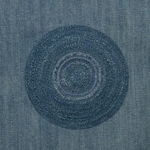
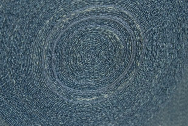
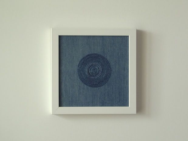
Maryrose Watson - Textile geometry and reflections of light. I loved the colours and intersecting lines that caught the light in her works. And I like how they were presented. It may seem like a simple element, a formality at the end of the creative process, but framing and the choice of mounting can really enhance a piece. It's something I don't really think about enough when I'm creating work but it ends up being a very important element when the piece is finished and on display. In Maryrose's works the woven threads wrap around heavy oak frames which are then mounted onto a second layer of oak. Giving the impression that they are suspended - floating on the wall.

Liam Flynn - Turned wooden vessels. Very beautiful and exquisite pieces, I could happily stare at one for hours and be absorbed by all the quiet details in the grain of the wood. These were some of the pieces I was itching to run my hands over!

Philip Moulthrop - Beautiful patterns and colours laid bare. Loved the splashes of unexpected colour and the intricate patterns uncovered in the wood.

David Pottinger - Woven patterns rendered in clay. Since ca and I go crazy over woven textiles normally it's no wonder we love Melbourne artist's David Pottinger's ceramic pieces whose patterned surfaces evoke the texture and detail of textile pieces. Here is an interview and studio visit posted on
The Design Files.

Jack Doherty - Ceramic alchemy. "One Clay, One Colouring, One Firing" a restrictive process but
the works themselves had a variance in colour and texture that belied this technique.

Jennifer Lee - Ceramics. It's difficult to put into words the beauty of Jennifer Lee's work, there's a
quiet quality to them that does not shout out and call attention to itself which is perhaps why I'm struggling. What I love about them is that each one looks perfect, the balance and their delicate forms seeming in contrast to the rough and subdued earthen texture of the clay.

Thursday, May 05, 2011

Etcc Exhibition

Hello again, I have some news to share about a group show Co and I will be taking part in called etcc. "etcc is a remixable art exhibition that seeks to explore ideas of creation and appropriation in the visual arts sector."

It opens next Friday at Ambush Gallery and is touring as part of Semi Permanent. There's an awesome line up of artists and it's also a pretty interesting format for a touring exhibition. Contributing artists selected a Creative Commons licensed image to base their artworks on. These new works will then be passed onto the next line up of artists on the tour to remix in turn.

Full details for the show can be found here.

Here's a sneak peek of our work. We'll have to beg someone to take some better photos for us on the night!

Show n' tell

I finally got around to scanning and photographing what co and I got up to at our class the other week so we've got a bit of show and tell for this week's post. The second day of letterpress class saw us work with wooden type to create 2 colour overprints. I played around with 'O' & 'As' while co got a bit tricky with her prints and offset her overprint to create a really nice xx pattern.

On our third and last day our project was to create fantasy business cards. I really love the new cards Hungry Workshop created for us so thought of creating a limited edition UK souvenir batch using one of our favourite catch cry mottos printed onto our existing cards.

Last weekend we headed to the Ephemera Fair on the lookout for vintage craft books, embroidered greeting cards and anything typographic and we didn't come home disappointed. I eyed some embroidered cards that I found at the very first table I found myself at. I though really hard about whether I could afford one (or maybe two) but contented myself with just the small booklet of stitches. We went on to discover a friendly retired printer that had an amazing collection of printed ephemera, antique labels that were as vibrant as the day they were printed. We also found another embroidery book and this lovely patterned annual report for the Society of Compositors. I thought the title referred to musical composers until co explained it meant type compositors/printers which explains the awesome printing.