Monday, June 20, 2011

London Fields and Turner skies

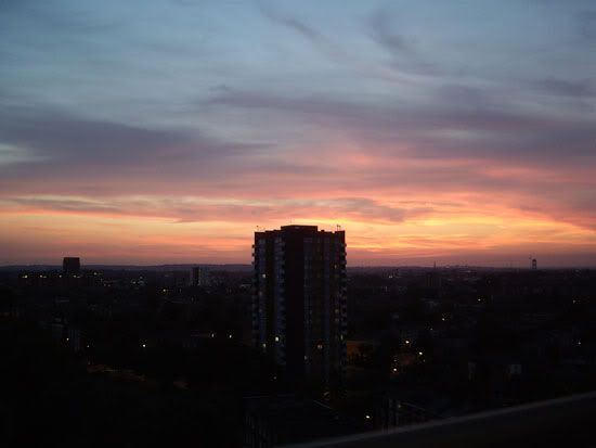
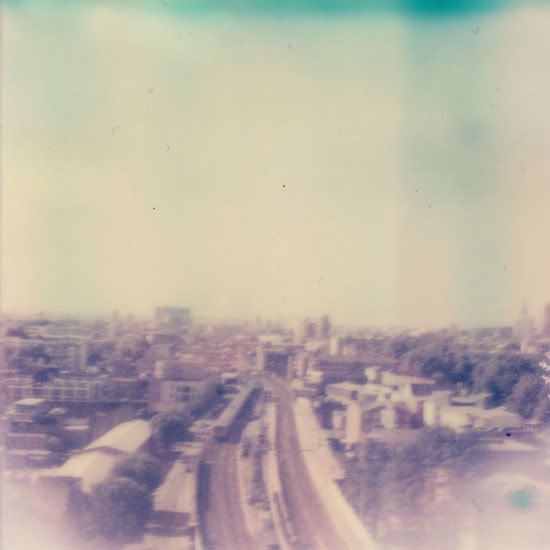
Hello I thought i'd write a post about where we live here in London and share some photos. We live in a small flat in a high rise right next to the park (and also right on top of the train line). It has its quirks, one side of the flat is curved with small windows cut into the side so it feels like we're in a floating boat perched high on the 10th floor. Being so high is great, we hardly notice the trains. And also the views are wow. I've never really wanted to live in a high rise before, I used to roll my eyes whenever Michael talked about wanting a place with a view of the city. I much preferred the idea of a garden and being part of the comings and goings of your street.. but I think i've been converted.

We have an almost clear 180 degree view of London because there are no other high rises near us. When the weather is good the sunsets are amazing, fiery and dramatic. And when the weather is bad it's just as amazing. You can see whole storms wash over the city, enveloping the skyline in a shroud of fog that just as suddenly lifts. We had one day when it was crazily alternating between grey cloud and rain to blue sky and sunshine.

I'm going to miss this view. Now if only our balcony faced the west, when I want to look at the sunset I have to jump onto a chair or the kitchen counter :)


1. The view from our balcony facing central London. 
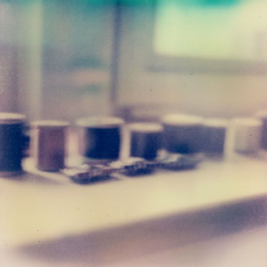
2. Some spools of vintage silk thread we picked up at a Vintage fair in Bethnal Green.
3. This was taken at around 9pm, the summer days are getting long. Sunrise is at about 4am and it doesn't get fully dark until past 10pm. The day sneaks up on you though, I think I have the whole day left to finish off work and then I check the clock and it's already 5 and time to think about dinner.

Tuesday, June 07, 2011

London. Perfect summer one day, rainy winter the next..

Hello, sorry it's been a while between posts. We had some alarming news last week concerning the flat we just rented that had us distracted and anxious for the whole of last week, but I think (and i'm trying not to relax too much in case I jinx us) that everything is going to be ok now. It was a fairly black week and I'm so glad we had some friends to talk to here and back home otherwise I don't know how we would have coped. When the dust settles we'll be able to shed more on this as I think it will be very helpful information for anyone planning to move to London and are looking to rent a place here.

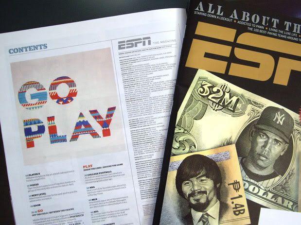
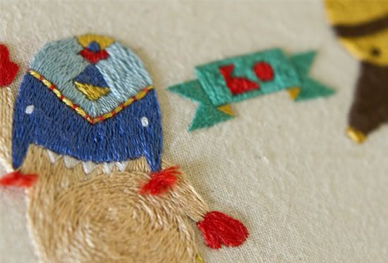
Ok so with that yuck news aside, Maricor and I are very happy to be able to share some of the new work that has kept us busy since landing here. We were commissioned by ESPN Magazine to create an embroidered piece of typography. Each issue they commission an illustrator or designer to a unique GoPlay graphic. For ours we extended our family of Sweater Letters, in the next few days i'll be able to post up some of the process work behind this project. And hopefully soon we can share more information about the other commissions we've been working on. There's another music lyric that's currently en-route to the framers back in Sydney as well as another set of Sweater Letters that are almost complete.


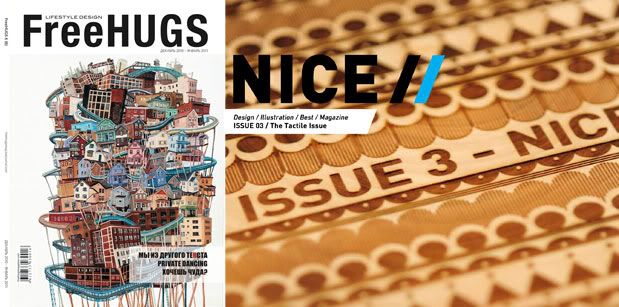
We're also been heaps excited to be featured in a few magazines lately, Freehugs Magazine from Russia and Nice Magazine an online magazine created by Nicework studio in South Africa.

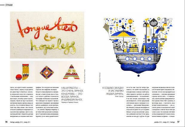
In this issue of Freehugs Magazine we were asked along with Bratislav Milencović, Alex Trochut and Teagan White to discuss hand crafted typography and its relevance today. Although each of our styles and approach to design is quite different, it was interesting to see that our motivations seemed quite similar. We all like to develop details in our work that draw the viewer in, desiring to create type that communicates something more than letters and words.

The third issue of Nice Magazine features our work alongside a bunch of amazing creatives including Coralie Bickford-Smith and Serial Cut. You can download all three issues here for free.


Bottom image: Freehugs Magazine spread, image on right hand page by Bratislav Milencović.

Tuesday, May 24, 2011

Sea Sew

We've finally unpacked our suitcases and have settled into a new home here in London, which explains why it's been a tad quiet on the blog lately. Although we didn't have much to move besides a couple of suitcases we've been busy criss-crossing town picking up stuff for the home, all the major things have been taken care of (kettle, tea and toast!) and its slowly starting to look like our place.

We've been on the look out for some brightly patterned textiles to make the place look cosy and we scored a great knitted throw from the Bethnal Green Vintage Fair on the weekend. If anyone can recommend any great second hand stores in East London we're keen to collect a few more bits and bobs for the house - crockery, cushions etc.

Besides moving we've also been busy sewing - we've got a few exciting projects we can share with you now. A limited edition pop-up book is being produced by Katana and created by the very talented Benja Harney for Kylie's Aphrodite Les Folies Tour in Australia and we've been asked to contribute some sewn illustrations for the book too. Below are some process pics and here you can read all about the making of the book. Look out for the wonderful illustrations by Jon Zhu!


A couple of weeks ago the etcc exhibition rolled into Sydney as part of the Semi Permanent design conferences. We posted a little about the exhibition earlier and here are some pics of the show. Below is our work and the creative commons licensed image that was the inspiration.  Images courtesy of aMBUSH Gallery.
We've also got an interview up on The Creative Haven where we give a bit of an insight into our work process, how we got into doing what we do and the people who inspired us in the first place. Thanks Carly for featuring our work!


Wednesday, May 11, 2011

Collect

We caught the last day of Craft Council's Collect exhibition at the Saatchi Gallery on Monday and
boy am I glad we got in to see it before it closed. I would love to collect a few of the pieces on show but alas will just have to look longingly at their websites in the meantime.

Below are a few of the artists that were standouts for me. I was taken in by the colours, patterns and textures of their works so although they are seemingly simple in their shape and form there's a lot going on when you get up real close.

Steffen Dam - Cabinet of glass curiosities. From afar his jars and glass cabinets seem to hold delicate aquatic specimens frozen behind the glass. Instead each piece is exquisitely rendered entirely in glass using a variety of techniques with some effects created through glass blowing processes that are traditionally seen as mistakes or faults.

"During my first ten years of glass making I was practicing and experimenting with all the different techniques to become a good craftsman. While doing so, I discovered a new kind of beauty in the fringes of the well crafted glass I was making. In the area of mistakes and faults - the unwanted air bubbles,
ash marks, soot, cracks and crookedness - I found something that cannot be predicted or sketched beforehand. I set the established and traditional techniques aside and started making glass all "wrong" in an attempt to capture the good in the bad. Out of these experiments came the "Fossils", "Plants" and other objects - like frozen extracts of chaos to be watched undisturbed" - Artist statement from exhibition.

Maryrose Watson - Textile geometry and reflections of light. I loved the colours and intersecting lines that caught the light in her works. And I like how they were presented. It may seem like a simple element, a formality at the end of the creative process, but framing and the choice of mounting can really enhance a piece. It's something I don't really think about enough when I'm creating work but it ends up being a very important element when the piece is finished and on display. In Maryrose's works the woven threads wrap around heavy oak frames which are then mounted onto a second layer of oak. Giving the impression that they are suspended - floating on the wall.

Liam Flynn - Turned wooden vessels. Very beautiful and exquisite pieces, I could happily stare at one for hours and be absorbed by all the quiet details in the grain of the wood. These were some of the pieces I was itching to run my hands over!

Philip Moulthrop - Beautiful patterns and colours laid bare. Loved the splashes of unexpected colour and the intricate patterns uncovered in the wood.

David Pottinger - Woven patterns rendered in clay. Since ca and I go crazy over woven textiles normally it's no wonder we love Melbourne artist's David Pottinger's ceramic pieces whose patterned surfaces evoke the texture and detail of textile pieces. Here is an interview and studio visit posted on
The Design Files.

Jack Doherty - Ceramic alchemy. "One Clay, One Colouring, One Firing" a restrictive process but
the works themselves had a variance in colour and texture that belied this technique.

Jennifer Lee - Ceramics. It's difficult to put into words the beauty of Jennifer Lee's work, there's a
quiet quality to them that does not shout out and call attention to itself which is perhaps why I'm struggling. What I love about them is that each one looks perfect, the balance and their delicate forms seeming in contrast to the rough and subdued earthen texture of the clay.

Thursday, May 05, 2011

Etcc Exhibition

Hello again, I have some news to share about a group show Co and I will be taking part in called etcc. "etcc is a remixable art exhibition that seeks to explore ideas of creation and appropriation in the visual arts sector."

It opens next Friday at Ambush Gallery and is touring as part of Semi Permanent. There's an awesome line up of artists and it's also a pretty interesting format for a touring exhibition. Contributing artists selected a Creative Commons licensed image to base their artworks on. These new works will then be passed onto the next line up of artists on the tour to remix in turn.

Full details for the show can be found here.

Here's a sneak peek of our work. We'll have to beg someone to take some better photos for us on the night!

Show n' tell

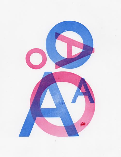
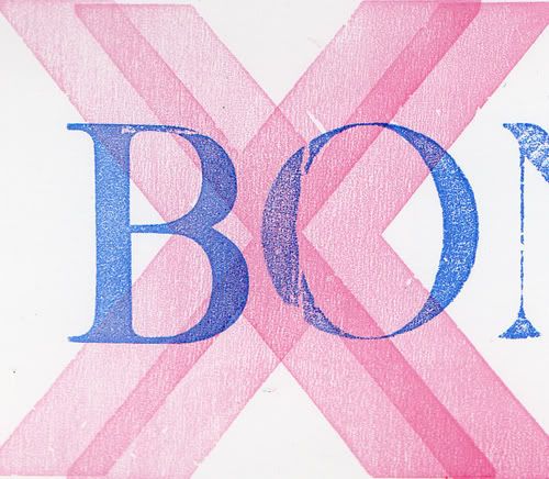
I finally got around to scanning and photographing what co and I got up to at our class the other week so we've got a bit of show and tell for this week's post. The second day of letterpress class saw us work with wooden type to create 2 colour overprints. I played around with 'O' & 'As' while co got a bit tricky with her prints and offset her overprint to create a really nice xx pattern.

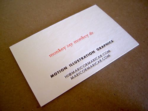
On our third and last day our project was to create fantasy business cards. I really love the new cards Hungry Workshop created for us so thought of creating a limited edition UK souvenir batch using one of our favourite catch cry mottos printed onto our existing cards.

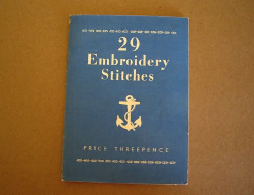
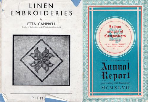
Last weekend we headed to the Ephemera Fair on the lookout for vintage craft books, embroidered greeting cards and anything typographic and we didn't come home disappointed. I eyed some embroidered cards that I found at the very first table I found myself at. I though really hard about whether I could afford one (or maybe two) but contented myself with just the small booklet of stitches. We went on to discover a friendly retired printer that had an amazing collection of printed ephemera, antique labels that were as vibrant as the day they were printed. We also found another embroidery book and this lovely patterned annual report for the Society of Compositors. I thought the title referred to musical composers until co explained it meant type compositors/printers which explains the awesome printing.


Thursday, April 28, 2011

Handsome Frank

We have some exciting news to share, MaricorMaricar have signed to the wonderful UK based illustration agency Handsome Frank! We're really stoked to join the family and be part of an amazing roster of creative and unique illustrators. If you are interested in commissioning work please get in touch with them or directly with us.


Monday, April 25, 2011

Playing with type

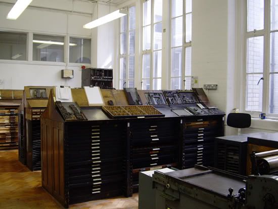
Last week we went to Easter School at Central St Martins. For three amazing days we got to play with lead and wood type and live out our type geek dreams. Years ago while at UTS we had the chance to go on exchange to CSM and being the naive silly girls we were, we didn't pursue it and regretted it for a long time. Thanks to the British Council's grant we received last year we finally got the chance to make good and study at CSM if only for a few days.

Letterpress is enjoying a revival at the moment, (Maricor posted last week about the letterpress cards that the Hungry Workshop made up for us) we're fans of the tactility and craft involved with letterpress especially in the movable type variety. In the class we were taught the fundamentals of setting up lead and wood type and creating short runs using the medium sized Farley press and the smaller Adana press. The thing that struck us the most about the process was how much it felt like you were solving a jigsaw puzzle when setting up the type blocks and spacing. And since we both really enjoy fiddly things like puzzles we were having an awesome time.

The downside was we didn't have enough time. Set up and cleaning takes so long that we really only printed for about 15 min out of the 10-4 class time we had each day. And I don't know how we can continue the new letterpress fascination we've now developed.

Our uni lecturers used to tell us stories of lead type being dumped onto the gutter when the huge presses were shut down. Helen Ingham our instructor told us a lot of the CSM letterpress type were salvaged from those dumping days. The history in the corridors, stairwell and workshops at CSM is overwhelming and to think it will all be gone soon, shafted all over to new campuses to make room for a luxury hotel development makes me sad. I hope all the letterpress equipment we used survives the move and continues to be used.


Tuesday, April 19, 2011

The Hungry Workshop are awesome

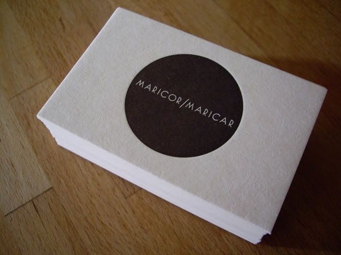
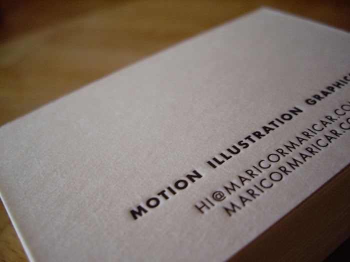
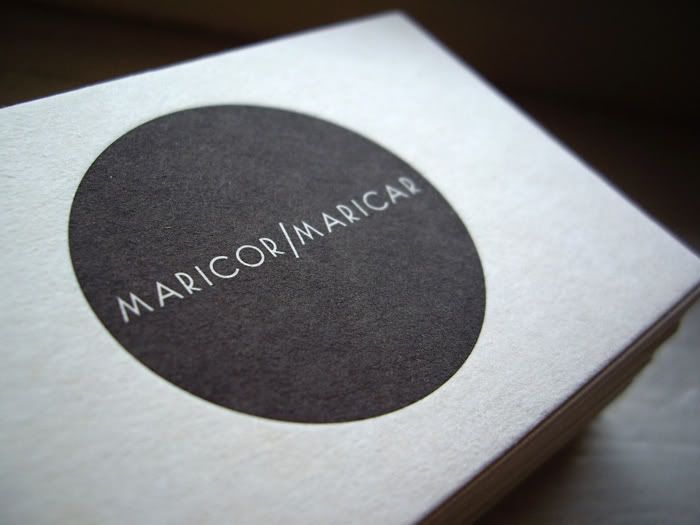
For our trip to London we really wanted to get some proper cards done (finally!) and wanted to do something a little special and something fitting to the tactile work we do. Luckily we stumbled across the letterpress work of The Hungry Workshop run by the awesome duo Simon and Jenna. Letterpress is something we've been dying to try as we've been interested in printmaking for a long time (we did a short course in stone lithographic printing at COFA a few years back and we've booked ourselves in for a letterpress course at Central Saint Martins while we're in London which started yesterday - so much amazing stuff to share about the class so we'll make sure to write a proper blog post about it after it wraps up).

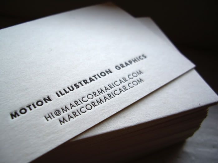
Please check out their site, it's chockas with some amazing prints they've collaborated on with other designers as well as custom designs they have created themselves. They were tremendously helpful with getting our business cards done and ready in time for our trip and we couldn't be more happier with the results. Below are the cards, we chose an uncoated, thicker card that suited the handcrafted feel of our work.

Beer Matt Board 390gsm
Pantone Black 5


Tuesday, April 12, 2011

Viral dancers

Great view from outside our window on Queensway the other day, watched a production crew and two prankster pop-locking dancers hidden in cardboard boxes jump out and freak out passersby. Trying to read the logo on their shiny orange and purple tops, one of them has a ranga up fro a'la Kid 'n' Play.

Will no doubt see the video up on youtube soon.

This week we managed to get away for some proper tourist fun times and spent a few hours at the Victoria & Albert Museum but unfortunately the Textiles room was closed! And won't re-open till 2013!! Bummer, but there was still heaps of things to occupy ourselves with and we will no doubt be revisiting again..and again.

Afterwards we lost ourselves in the amazing scarves hall at Liberty, drooled over a couple, the patterns, the colours!! Oh well, first excuse we get to reward ourselves you know where we'll be heading.

And just to prove we haven't been slackers, here are a few snaps our friend Catherine took at Kensington Park over the weekend. The sun was out and it was WARM, dare I say hot for London in the spring so we packed up our sewing bags and took our work to the park. Here's a sneak at the sewing we're currently working on, there's a few commissions on the go so in between house hunting and quick trips around London seeing the sights we've been busy bees again sewing up a storm.

Monday, April 04, 2011

London Calling


So long Sydney, we're sad to say goodbye but hello London!

We arrived early Tuesday morning at around 5.30 and after 24 hours flying thank goodness we opted for a cab transfer from the airport. I doubt we'd have made it to our friends' place otherwise. The flights themselves were pretty good but any extended period of time suspended in halfway time between your old timezone and your new one is always disorienting and exhausting. On the second leg from Hong Kong to London we somehow managed to score first row seats which meant we had extra leg room. I felt a bit guilty though. Since we're small asian girls we were in the least need, especially as there seemed to be a whole fleet of giant rugby fans/players crammed in nearby.
Our first week has been a mix of work and exploring.. sadly more of the former. We sorta nerded out and made sure we hunted down an art supply store, fabrics and craft store and grocery shops nearby. No denying where our priorities lie :)
On Saturday we checked out a couple of Markets around east London. I scored a rope necklace at the new Designers Markers Market and we ogled the beautiful food (and people) at Broadway Market. We're hoping to find a rental nearby since the markets are so amazing. I miss living in Newtown and it feels somewhat similar, a cross between Newtown and Surry Hills.

This week we have a commission to finish that's been keeping us from exploring more. I shouldn't complain about being busy but it's a bummer we're stuck indoors. Oh well we'll just have to sew like crazy :)

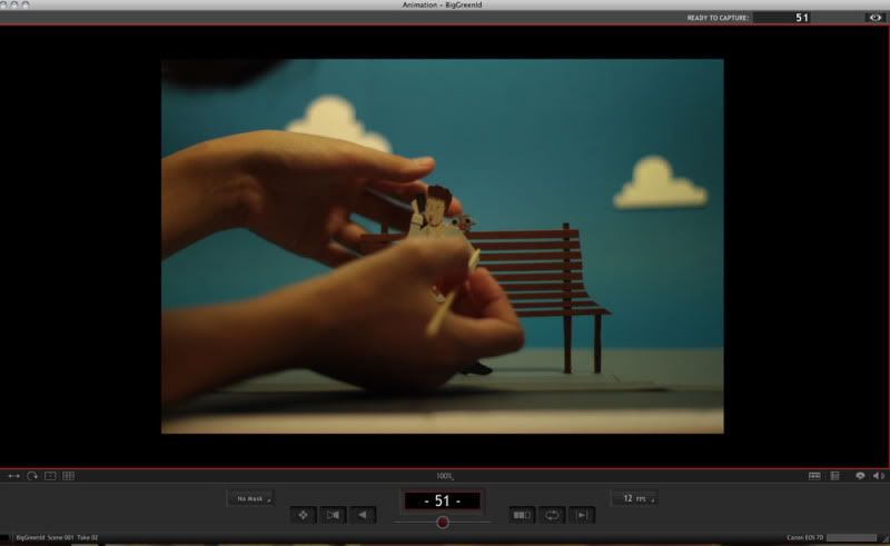
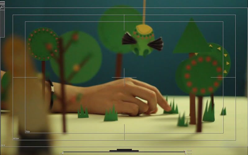
Maricor and I have also put up a massive update on our site. The full series of embroideries from our Turns of Speech & Figures of Phrase exhibition is up as well as the latest Global Village artworks and an illustration we made for Anorak Magazine's Food is Fun series. We are also proud to share our latest animation that we created for British Council Australia. Together with Republic of Everyone we created an animation to help launch Big Green Idea, a great funding initiative by the British Council. We worked on it before we flew out and had to multitask more than usual for this project. Making the props, rigging, lighting, camera ops and post production. It was a bit of a stretch at times! Although it was a busy two week we had a great time working on it, coming up with the cute paper characters and learning new techniques.

Thursday, March 17, 2011

Non-stop stop motion

We're very excited about the latest project we've been busy working on which will go live very soon, in the meantime here's a sneak peak. A paper based stop motion animation...in two weeks. No tag teaming on this one, all hands on deck!

Monday, March 07, 2011

Muscle On

A few big things to blog about this Monday so this is going to be a long post!

First up, our first ever solo show opened at Mart Gallery last week. Huge thanks to Mel for having such an awesome space and hosting us, Sam for lending us your muscles for bump-in, Ly for coming early and helping set up and Ben and Michael for manning the drinks table and to everyone who came and made it such a great night. "Turns of Speech & Figures of Phrase" will be up for the next 2 weeks until the 19th of March. Also Ca and I will be at the gallery this Wednesday (the 9th) from 1:45 - 3:45 if anyone wants to drop by and have a chat. There are a few more pieces still up for grabs, we'll have pictures up soon.

We'd also like to thank these sites who have posted up our work, its awesome to know that our work is liked! Cheers Sick of the Radio, Design Work Life, GraphismWalk the Sand, Portable.TV, MrXStitch, August Empress, Las Teje y Maneje, Banana Meet Cute, Jessica Swift, Might & Wonder and The Brag for the very kind words.


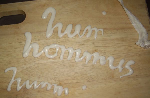
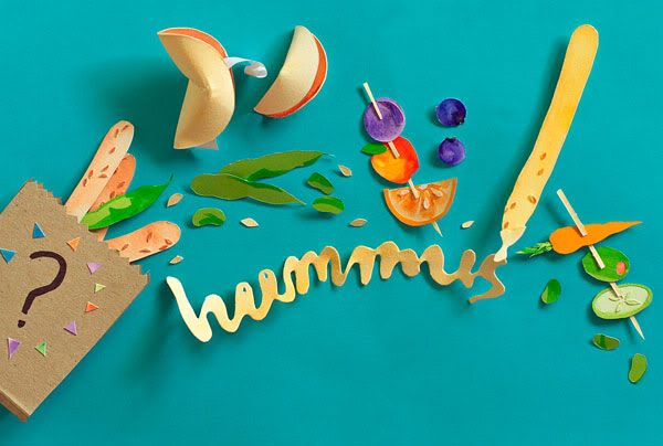
We mentioned in the last post that we we're madly tag-team sewing the last piece for the show. Well, in between the sewing we also took turns whipping up an illustration for Anorak Magazine's Food Is Fun project. Our paper illustration is now up on the Anorak site, it's bursting with fortune cookies, fruit and vegie kebabs, cursive hummus and more yummy stuff. Here's a process pic of some goo-ey glue paste type...


We're prepping for our trip to London so we're sorting out what we can take with us and what we'll have to leave behind. As we're not going to be able take all our prints with us our Big Cartel store is now on sale! Our risograph prints are all reduced and I've put the sewn piece "Get All Up In My Goat" up on our store too.

We're heading to London at the end of March, please get in touch if you're in that part of the world and could use a couple of nimble fingered illustrators/designers.

Monday, February 28, 2011

Tag teaming

Our first solo exhibition is happening later this week and we're so close to finishing. We're cutting it a little fine again, but we couldn't resist doing one more embroidery. A week out from opening night we decided it would be a great opportunity to work on a larger piece so we're madly sewing to get it finished for bump in.

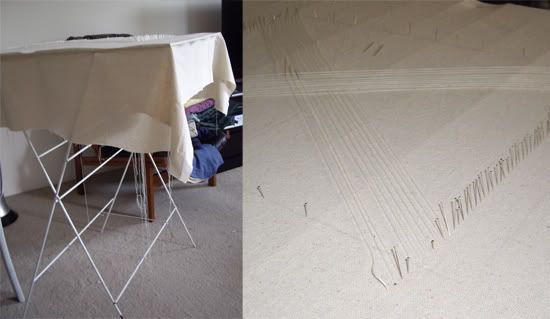
It's a little different to the rest of the works (we're calling it the bonus track of the playlist) and is a hint to what our future embroidered projects might look like so I'm pretty excited to see how it turns out. Co took some photos of the set up we McGyvered up for it. To handle the size of the design (75x75cm) we improvised a frame/stand by pinning it to the top of an old clothes horse we had lying around and it's done the trick so far. We're literally working around the clock to get it done in time. Tag teaming sewing shifts so one of us sews while the other naps. It feels just like uni days and our final year Major Project!

Also for those in Melbourne, Matt Huynh's latest exhibition of work Aurora sounds like it's going to be amazing. I'm pretty bummed that we we won't be able to see it. There's more info on his blog and site but here's a little excerpt that got me very excited. "This installation is a very large-scale charcoal and pigment drawing on 100% cotton watercolor paper running down the length of the entire gallery." Woah.. i'm usually overwhelmed working any larger than A3! The show opens March 10 at Lamington Drive Gallery.

And another project well worth supporting is the "What Song is That" project by Little Gonzales and Michael Wilton - a book of quirky pictograms. They've set up a pozible (fundbreak) project. Click here for more info on how to support them and help get the book published.

Monday, February 21, 2011

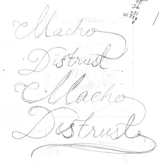
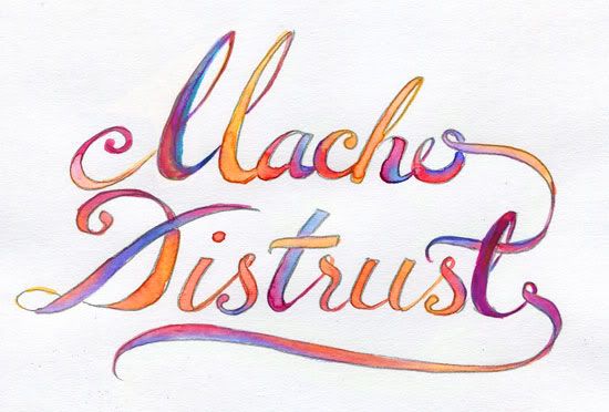
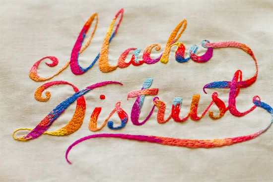
Macho Distrust - process

Thought it would be nice to share some of our process work in the lead up to our exhibition. I really enjoy 'making-of' videos and looking at process work and seeing how ideas develop. Not to mention it's always great when artists/designers share tips, I hope we can do the same.

This piece is one of co's and is inspired by Blondie. The words aren't meant to be taken too seriously. We were drawn to them because our work has often been described as cute, feminine etc and we used to think that was a bad thing. We've realised we do what we do, trying to act differently (in this case macho) or be something else is a waste of energy and also maybe insincere. I was reminded of this after reading a blog post by Lilly Piri this morning.

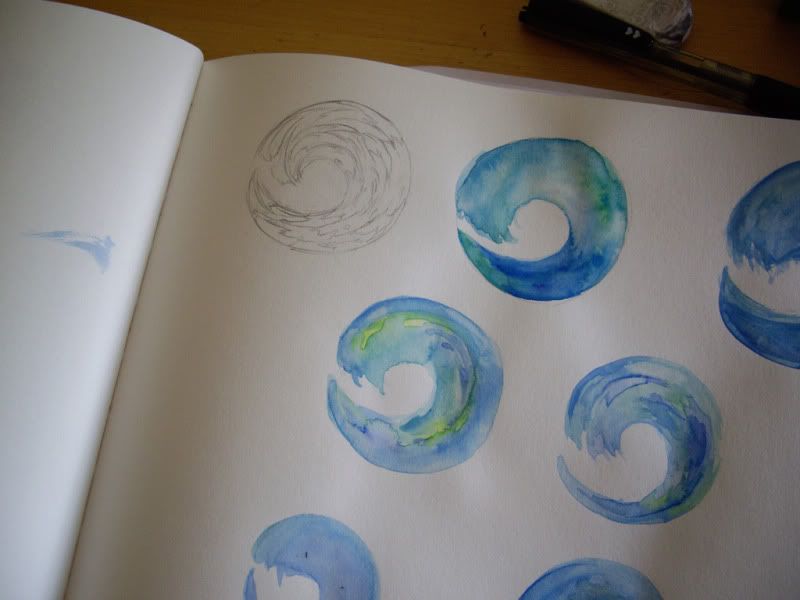
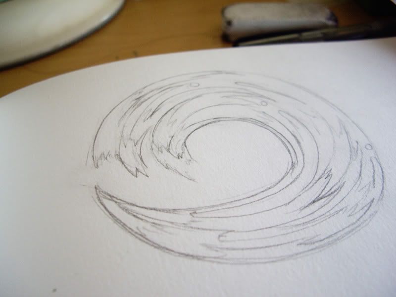
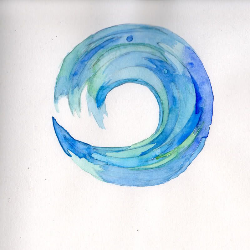
Co worked up the type in a series of pencil and pen sketches. The type is then refined using water colours with some adjustments in Photoshop. Sometimes we'll start a piece knowing what colour combinations we'd like to use but the water colours help add some randomness and some interesting gradients we'd not usually use.


Thursday, February 17, 2011

Busy Bs

Hello! This week has turned out to be pretty hectic so the usual Monday blog post is terribly late. We've finally finished the pieces for our Mart show and they are at the framers now. We'll be posting up some process work soon.

Also, recently we've had some lovely write-ups about our show. We were pretty stoked to be on Booooooom! and also today the amazing Pip Lincolne of Meet Me at Mikes just posted up about our work too. Yay! We'd also like to give a huge thanks to Yen Magazine, Lifelounge, Frankie, Tough Titties and What Katie Does for writing up about us as well.

Also if you have time, we posted up some new work over at our site. There's a new Epic Battle and also the Sweater Letter co posted a sneak peek of a few weeks back is now finished. Hope you enjoy!

Tuesday, February 08, 2011

MaricorMaricar at Mart Gallery March 3-19

Maricor and I are very proud and excited to be having our first ever solo show next month at Mart Gallery.

'Turns of Speech & Figures of Phrase'is inspired by song lyrics misheard and mixed up. We've swapped pen and paper for needle and thread to create a mixtape compilation of hand-crafted type, based on lyrics borrowed from bands featuring Blondie, Paul Simon and Pavement.

The show opens on the 3rd March 5.30PM, hope to see you there!


Monday, February 07, 2011

What we did this Summer

We've just had a week long heatwave in Sydney. At first I was rejoicing after complaining about the lack of beach worthy days over the Christmas /New Year's break but after the first 4 days of 30+ heat in an unair-conditioned apartment that absorbed heat and refused to let any breeze it got a bit much.

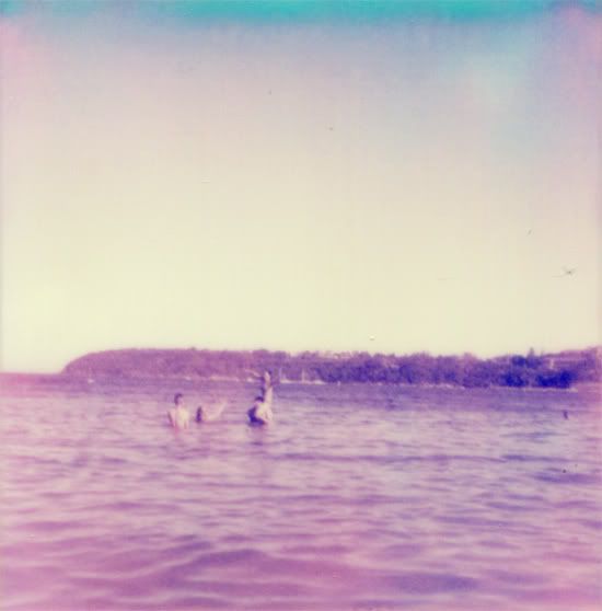
Luckily since we work from home and are flexible with our hours we were able to escape to the beach every few days to cool down. Balmoral beach has become our favourite spot. It's calm and stays pretty shallow for a good stretch so I can learn how to swim without getting dunked every few minutes and best of all it's usually not that busy.

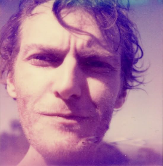
I tested out my Christmas present from Michael at the beach - an old Polaroid sx70 One Step Sonar with some colour film from the Impossible Project. It's been tricky figuring out the best lighting. So far all our shots have had a very pink/purple cast. We created a protector for the film so it's shaded from sunlight as soon as it exits the camera but still no luck. Has anyone got any tips for using the Px70 Colour Shade push film? I'd really like to get the colours looking more even and some darker blues.

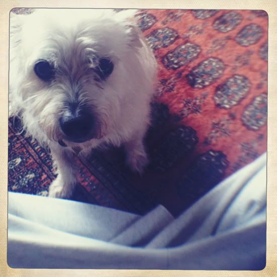
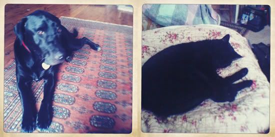
Over the Christmas Michael and I stayed for a week in the Blue Mountains and took care of Sheba, Charlie, Olive and Dennis. I've never had a pet so looking after two dogs and two cats was pretty exciting. It was nice having a full house and despite a few minor accidents I think they were pretty happy. Charlie and Sheba are a pretty odd couple, Sheba is so big and yet you get the feeling that it's Charlie calling the shots. He's pretty adorable especially with his mane of fluffy hair on just the top half of his body, he looks like he's rocking a Mad Max style outfit. (no photos of Olive and Dennis but M's cat Freya dropped in for a few days)

My gift to M was some lens attachments for his iphone camera. I'm amazed at the amount of detail the macro gives and the wide ispretty impressive too. Here are some test shots using the macro and wide on the same cactus plant to compare. The lenses are available from Photojojo.